iPhone Duo App Design: What Founders Should Fix First
Apple's foldable went on sale October 23. Most startup apps will run on it today, but custom layouts will show their seams. Here is where to look and what to do first.
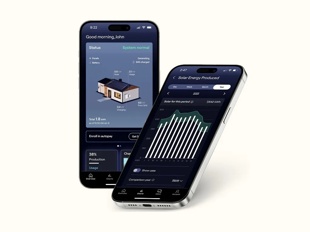
iPhone Duo app design is now a real question for every founder with an iOS product. Apple's foldable went on sale on October 23, and the good news is that most apps will run on it without changes. The bad news is that "runs" and "looks right" are different things, and custom interfaces are where the gap shows first.
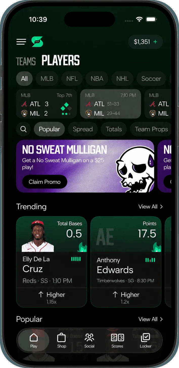
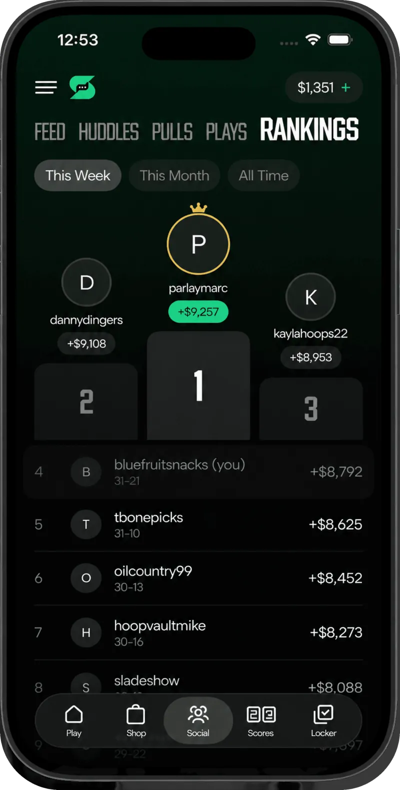
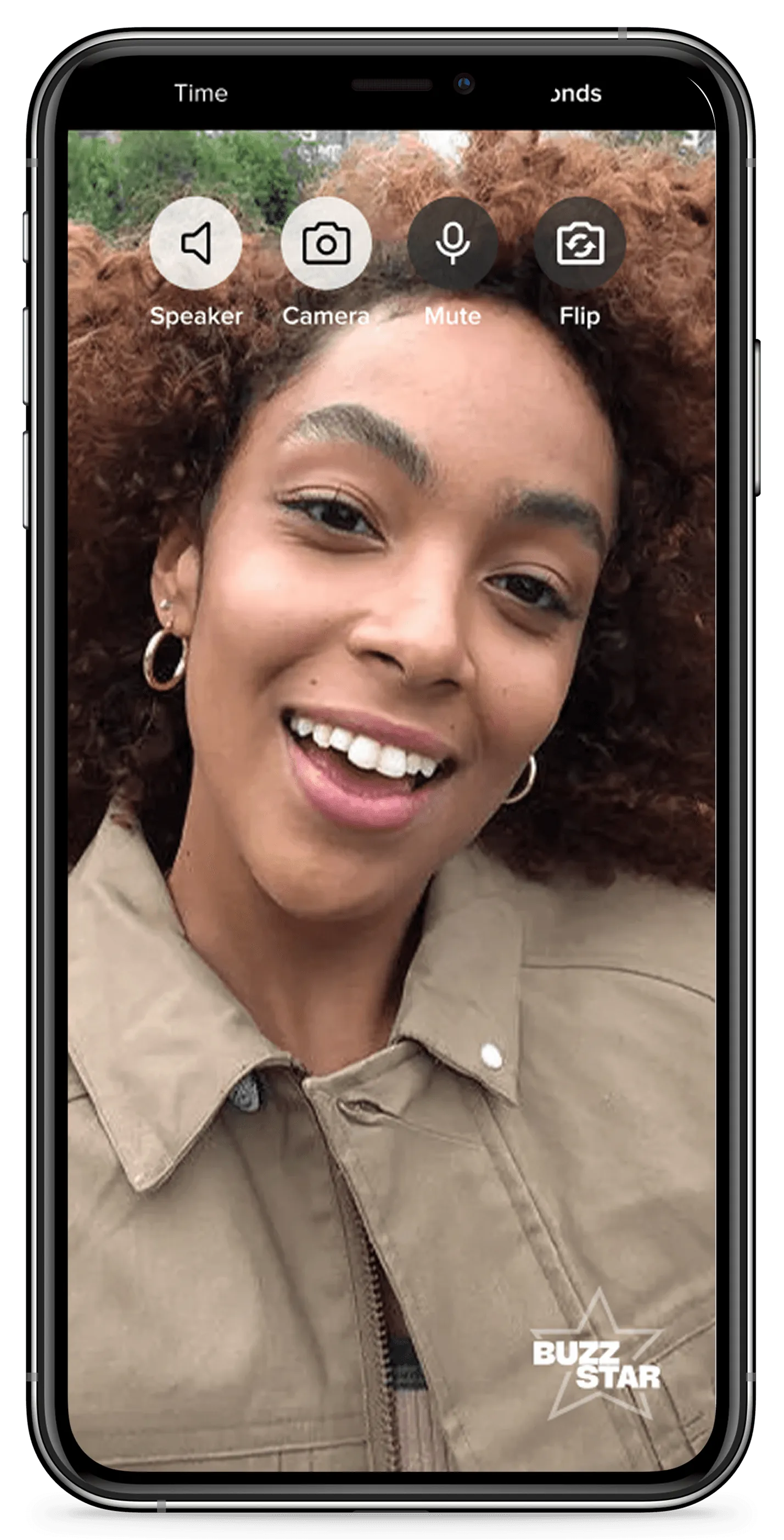
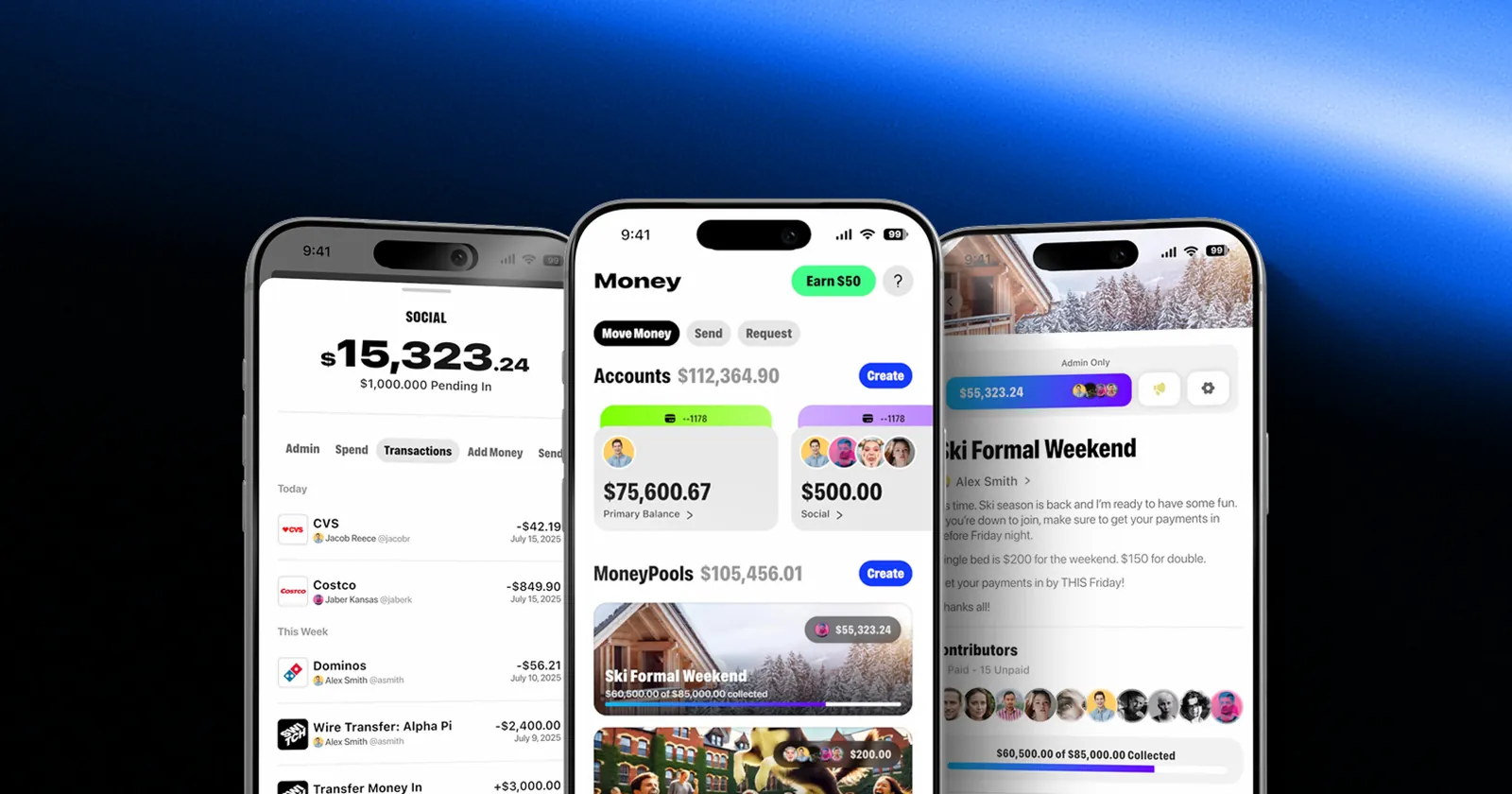
This guide covers what Apple has published, what tends to break in startup apps and the fixes to make first. It is the kind of review our design team runs whenever a platform shifts under the products we work on, from social sports at Smacktok to creator video calls at BuzzStar.
What changed on October 23
Apple's developer announcement sets out the basics:
- iPhone Duo is available to customers as of October 23, 2026.
- Xcode 27.1 adds iPhone Duo support. Apple asks developers to recompile and use Device Hub to see how apps behave across every pose and orientation.
- Screenshots become mandatory. Duo screenshots are optional today, and apps that include them get a badge on the product page. Starting April 2027, every app or game submitted needs them.
The device itself is the design problem. According to Apple's Design for iPhone Duo session, the outer display is wider and shorter than a traditional iPhone, and the inner display is the largest ever on an iPhone. It can be held partially folded like a book, set on a table like a small laptop, or stood up on its edges. Your app can move between those states while someone is using it.
How existing apps behave on iPhone Duo
Apple's engineering session, Prepare your app for iPhone Duo, explains what happens depending on how your app was built:
- Built with an older SDK: the app works, but it does not use all of the screen. On the inner display it appears at a familiar iPhone size and aspect ratio.
- Built with the iOS 27 SDK: the app extends further across the inner display.
- Built with the iOS 27.1 SDK: the app runs edge to edge, and standard navigation and toolbar buttons lay out vertically along the side of the outer display.
That last point is the big visual change. On the closed device, controls such as the tab bar, toolbars and the back button move to the side, where they are easier to reach. If there is not enough room, they collapse into an overflow menu automatically.
Apps built with standard components get most of this for free. Apple lists split views, tab views, sheets, popovers, context menus and alerts as adapting to every pose without extra work. Sheets, alerts, menus and toolbar buttons also avoid the fold on their own, because Apple found buttons are hard to tap when they land right in the crease.
Where startup apps break
Speed is how most MVPs get built, and speed often means custom UI. These are the patterns most likely to look wrong on iPhone Duo:
- Custom navigation and tab bars. A hand-built bottom bar does not move to the side with the system controls. On the outer display it can end up fighting the system layout or sitting under the side controls.
- Fixed widths and breakpoints. Apple's guidance is blunt: avoid fixed widths, breakpoints or metrics tied to a specific screen. Layouts that assume a phone is a certain width will stretch, crop or float in the middle of the inner display.
- Orientation locks. The inner display does not honor your supported interface orientations. If your layout code checks orientation or device type, switch to size classes.
- Symmetric margins. Safe areas on iPhone Duo are often asymmetric, and vertical controls can appear on the left in landscape and in split view. Code that doubles the left inset to get a width will be wrong.
- Buttons in the fold. A floating action button or a custom card centered on the screen can land in the crease when the device is partially folded. Scrolling content is fine there. Tappable controls are not.
- Assuming one screen. Apple notes that referring to the main screen in code is ambiguous on a device with two displays and will be deprecated. Read sizes from the window scene or the environment instead.
iPhone Duo app design: five decisions for your product
Design for two size classes, not five poses
Apple recommends focusing on compact width for the outer display and regular width for the inner display. That is two layouts to get right, not one per pose. Most startups already have the pieces if they designed for iPhone and iPad.
Decide whether you want a sidebar
On the inner display, a tab bar can become a sidebar. Apple points to information-dense apps as the best fit. Dashboards, finance tools, inboxes and admin views gain the most. A simple consumer app with three tabs may not need it.
Keep the hierarchy identical inside and out
People will open and close the device often. Apple's advice is that your hierarchy should not change between the outer and inner displays, and that no feature should depend on a specific pose. If a control exists when the phone is open, it must exist when it is closed.
Treat the seated pose as optional
When the device sits on a table like a laptop, Apple suggests media on top and controls on a stable base at the bottom. It suits video, calls and creation tools. For most apps it is a nice extra, not a launch requirement.
Use the extra width for content, not chrome
A larger canvas tempts teams to add panels. The better use is usually a two-column layout that shows a list and its detail at once, the same way a stacked layout rearranges itself when there is more horizontal room. AI features benefit here too: a source document next to the summary it produced is exactly the kind of "show your work" pattern we describe in designing AI products that build trust.
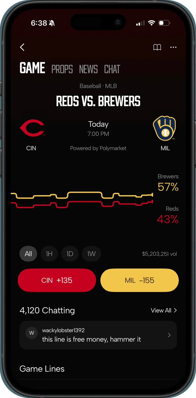 Case study · SmacktokConnect. Compete. Win.See the work
Should a startup design for iPhone Duo now?
It depends on where you are.
Before launch. Do not add Duo-specific screens to your MVP. Do insist on standard navigation, size classes and safe area layout from the first sprint. It costs almost nothing during the build. If you are planning a first version, our playbook for building an AI MVP in 30 to 60 days covers how we keep scope tight without painting the product into a corner, and the guide on how long it takes to build an MVP shows where a step like this fits.
Live with real users. Recompile with Xcode 27.1 and run the audit below. Fix whatever breaks your core flow first. A wallet, a booking screen or a checkout that hides a button behind the side controls is a bug, not a polish item.
Planning a release after April 2027. Budget for Duo screenshots in your store assets. Apple has also added a preview tool in App Store Connect so you can see how screenshots and other metadata look on an iPhone Duo product page before you submit. While you are in App Store Connect, check your subscription purchase options too: Apple now sells subscriptions to companies and schools by default, and our guide to App Store multiseat subscriptions covers what to decide.
A one-week iPhone Duo audit
This is the order we would work through for an app that is already live:
- Day 1: recompile and look. Build with Xcode 27.1, open the iPhone Duo simulator in Device Hub and record every core screen closed, open, rotated and partially folded.
- Day 2: list what breaks. Note covered controls, cropped content, buttons near the fold and screens that float in the middle of the inner display.
- Day 3: swap custom chrome for standard components. Navigation, tab bars, sheets and toolbars first, since they carry most of the automatic behavior.
- Day 4: fix layout math. Replace fixed widths, orientation checks and symmetric inset math with size classes and safe area insets.
- Day 5: test split view and ship. Drag the app to each side of the inner display, check that controls follow the outer edge, then release and capture Duo screenshots for the product page.
For a small, focused app, a week is a realistic target. Larger products will need longer, but the order stays the same: core flow first, everything else after.
The takeaway
iPhone Duo rewards apps built the boring way: standard components, size classes and safe areas. If your app took shortcuts to ship fast, that was the right call at the time, and now is a good moment to pay a little of it back. Recompile, find the screens that break, fix the core flow and add Duo screenshots before April 2027. If you want a senior crew to run that audit with you, book a call.
Questions founders ask
Will my existing app work on iPhone Duo?
Yes. Apple says apps work on iPhone Duo even if they were not built with the iOS 27 SDK. They just will not use the full display, and custom layouts may look cramped or off center until you recompile and test.
Do I need iPhone Duo screenshots to submit my app?
Not yet. Apple says that starting April 2027, any app or game submitted will need to include iPhone Duo screenshots. Adding them now gets your product page an optimized for iPhone Duo badge.
How do I test my app on iPhone Duo without the device?
Use Xcode 27.1 and the iPhone Duo simulator in Device Hub, which lets you open, close, rotate and fold the virtual device and check every pose.
Should an early-stage startup redesign its app for iPhone Duo?
Usually not a redesign. Recompile, fix the screens that break, adopt the standard navigation components and add a sidebar on the inner display if your app is information dense. Save custom pose layouts for later.