Beverage Packaging Design: A Founder's Guide to Winning the Shelf
A drink gets about one glance on a crowded shelf. Here is how to design packaging that earns the pick-up, scales to new flavors and still works on your phone screen.
Beverage packaging design decides whether a new drink gets picked up or walked past. On a cold case or a crowded shelf, your can or bottle has about one glance to say what it is, who it is for and why it is different, and then it has to do the same job again as a thumbnail in a delivery app. For a startup without a big ad budget, the package is the ad, the salesperson and the brand all at once.
This guide covers the tests strong drink packaging passes, how to build a flavor system that scales, the label rules to plan for, and what to put in a brief. It comes from the brand identity work we have done for consumer brands like BeatBox, DrinkAde and Stacked Sauces, where packaging was designed together with the identity, not after it.
What beverage packaging design has to do
Packaging carries more weight in beverages than in almost any other category. People often choose a drink in a few seconds, standing up, next to dozens of competitors. A strong package does four jobs:
- Get noticed. It has to break the pattern of the shelf around it. If every brand in your aisle uses white space and thin type, loud color wins, and the opposite is true too.
- Explain itself. In a second, a shopper should know what the drink is and when to drink it: party punch, a morning-after shot, sparkling water, an energy drink.
- Signal the price and the person. Materials, type and finish tell people whether this is a treat, a staple or a premium pick, and whether it was made for someone like them.
- Look good after purchase. Drinks get held, photographed and posted. A package people want in the picture does marketing for free.
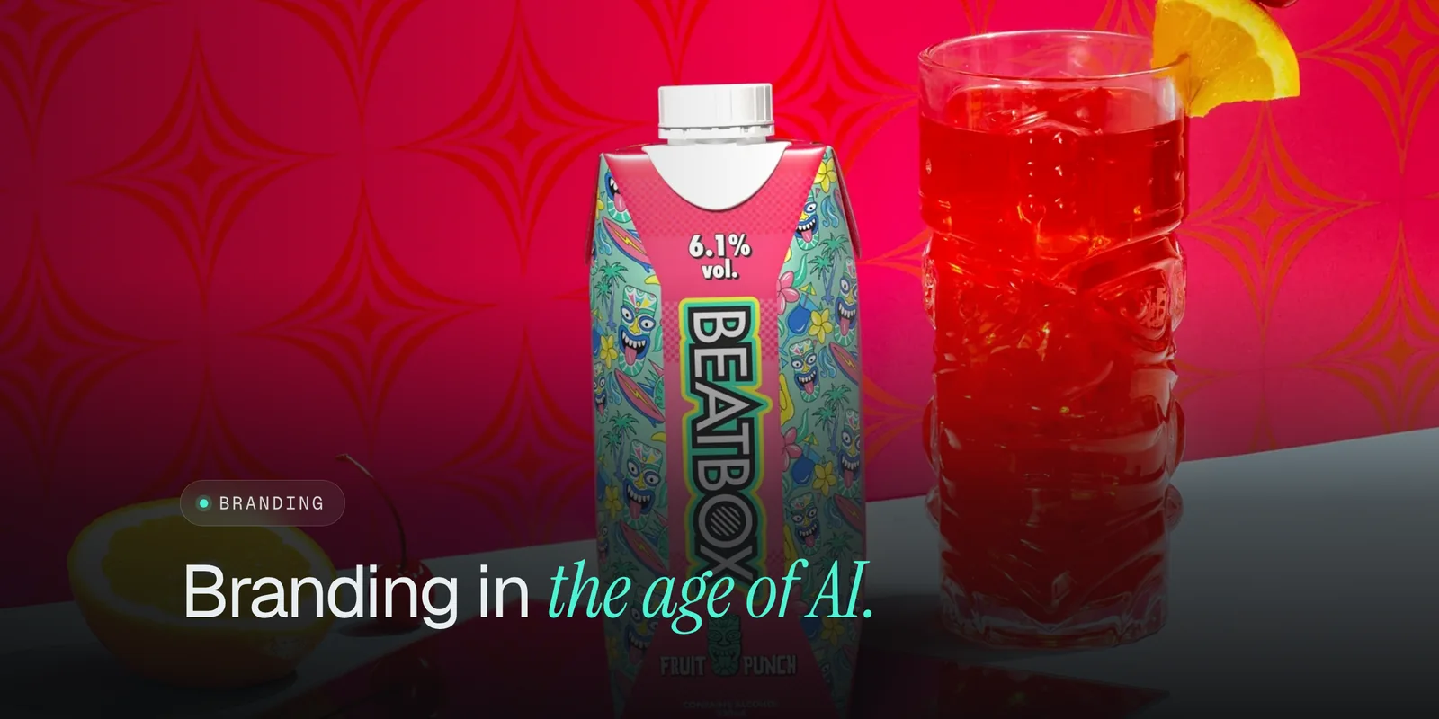
BeatBox is a clear example. The product was ready-to-drink party punch in boxes and cartons, with nostalgic flavors, eco-friendly packaging and resealable convenience. Our job was packaging that grabs attention on the shelf and says party in a box before anyone reads a word.
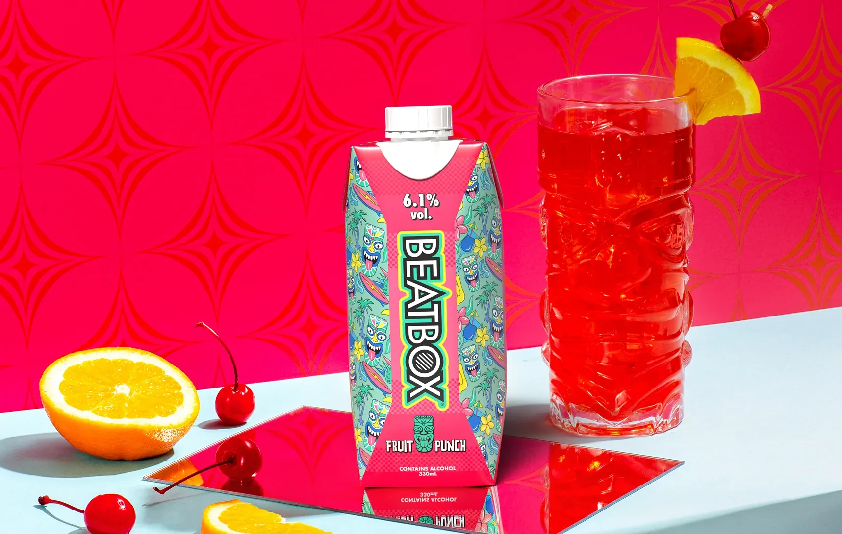 Case study · BeatBoxParty outside the box.See the work
How to pass the shelf test
Before any detail work, test the design the way shoppers will see it. Three checks catch most problems:
- The arm's length test. Print the design at real size, put it on a shelf next to the competitors you will actually sit beside, and step back two meters. Can you find it instantly? Can you tell the flavor?
- The thumbnail test. Shrink the front of the package to the size of a product tile in a delivery app or on your own store. If the name and flavor disappear, the hierarchy is wrong.
- The blink test. Show the design to someone for two seconds, then ask what the drink is. If they cannot tell you, the package is decorating instead of selling.
Category codes matter here. Shoppers have learned what certain drinks look like, and a design that ignores every cue can read as the wrong product. The skill is keeping one or two familiar signals, so people know what aisle they are in, and breaking the rest so they notice you.
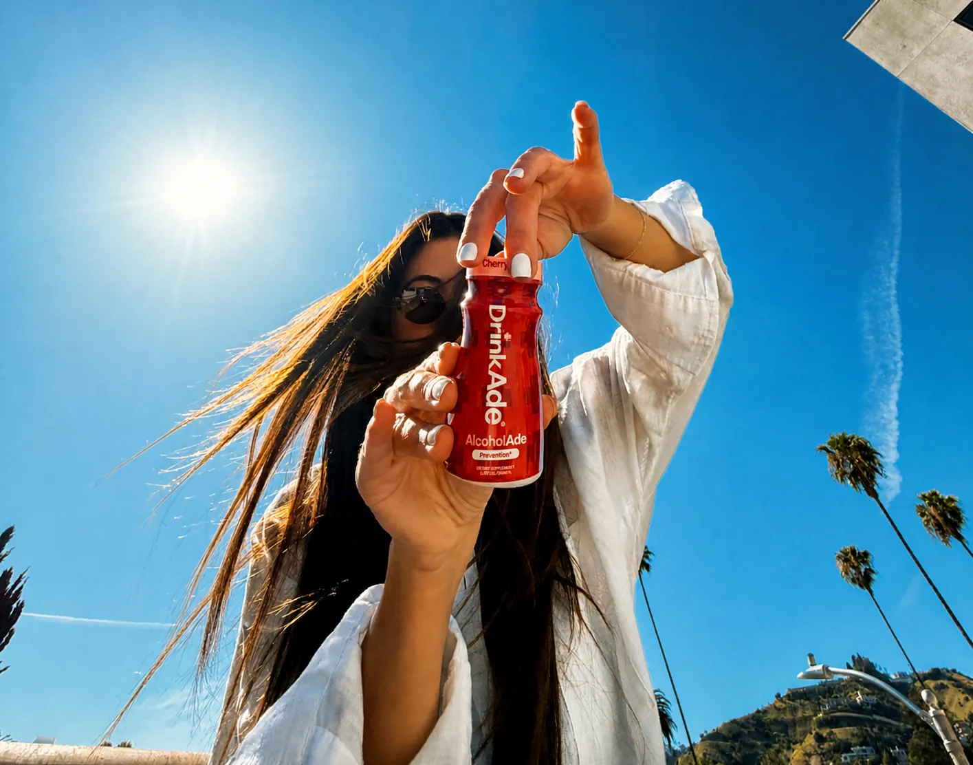
DrinkAde faced exactly this. As we wrote in the case study, hangover products tend to look like medicine or a frat joke. The brand needed to feel like part of the night out: clean, confident and fun enough to pass around the table, with the science to back it up.
Designing a flavor system that scales
Your first flavor is a design. Your third flavor is a system. Most young drink brands launch with a few flavors and add more, so the packaging has to be built for a line from day one.
The rule that works: fix the parts that say who you are, and let a small number of parts change per flavor.
- Fixed: the logo, its position, the layout grid, the type, the brand block and how claims are written.
- Variable: usually one color per flavor, plus an illustration, photo or pattern that shows the taste.
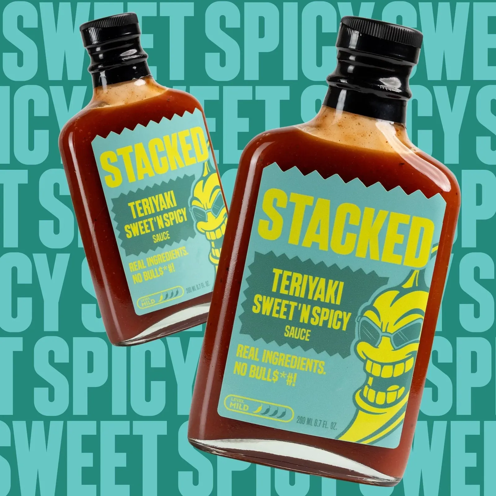
For DrinkAde we designed a color-coded bottle system that reads instantly across Berry Boost, Cherry Ice and Lemon Lime. Each bottle stands out on its own, and the three together read as one brand on a shelf or in a social post. Stacked Sauces is a food brand, not a drink, but it follows the same logic: every flavor gets its own color and character inside one bottle system, so the line still looks premium on a shelf, a grill and a TV set.
Plan colors as a set, not one at a time. Pick them so they stay distinct next to each other, under store lighting and on a phone screen, and leave room in the palette for the flavors you have not invented yet.
Beverage label rules to plan for
Packaging design is also a compliance job, and the rules depend on what is in the can. Plan for them early, because moving a required panel late in the process can break a layout.
- Non-alcoholic drinks. In the US, labels for most packaged foods and drinks follow the Food and Drug Administration's food labeling requirements, which cover things like the nutrition panel, ingredient list and how claims can be worded.
- Alcohol beverages. Most beer, wine and spirits labels need a Certificate of Label Approval from the Alcohol and Tobacco Tax and Trade Bureau, which brands apply for through COLAs Online before the product goes to market.
- Everything else on the back. Barcodes, recycling marks, deposit information and retailer requirements all take space. Ask your co-packer and your first retail buyer for their specs before you finalize.
We are designers, not regulatory lawyers. Have a specialist review the final label before anything goes to print, and design the back panel with the same care as the front, since it is where people check whether to trust you.
Beyond the package: displays, store and social
A drink brand lives in more places than the can. Shoppers meet it on a counter display, a Shopify product page, a delivery app tile and a friend's story. The packaging should set the rules for all of them.
For DrinkAde, the same system carried into a fast Shopify storefront, point-of-sale displays for retail and a steady stream of social and launch collateral. For BeatBox, the identity extended into a high-converting website that tells the story and drives sales around the clock. When the package, the store and the feed look like one company, every touchpoint makes the others stronger.
That is the argument we make in startup branding in the age of AI: a brand is a system that holds across product, packaging and pitch, not a logo. And if you are still choosing what to call the drink, start with how to name a startup, because the name is the largest word on the front of the package.
What to put in your packaging brief
A good brief saves weeks. Before you talk to a designer, write down:
- The drink and the moment. What it is, when people drink it and what they reach for today instead.
- The shelf. Where it will sell first, which brands it will sit next to, and the format: can, bottle, carton or pouch, and its size.
- The line. How many flavors at launch and how many you expect in the next year.
- The hard constraints. Label requirements, co-packer specs, print method and budget per unit.
- The feeling. Three words for how the brand should feel, and one brand from another category you admire.
At King Tide, a brand identity is $3,500 and takes four to eight weeks, covering strategy, the identity system and guidelines. Packaging is scoped and quoted up front alongside it, and our brand identity cost guide explains what changes the price. After launch, new flavors, retail displays and campaigns can run through a monthly design team from $3K a month.
The takeaway
Beverage packaging design is a shelf problem first: be found in a glance, explain the drink in a second and look like one brand across every flavor. Test at real size and as a thumbnail, build a flavor system before you need it, plan the label rules early and carry the same system into your store, displays and social. If you are launching a drink, tell us about it.
Questions founders ask
What makes good beverage packaging design?
Good beverage packaging is recognizable from across the aisle, makes the flavor and the job of the drink obvious in a second, and works as a system as you add flavors. It also has to read well as a small image online, where many first purchases now start.
How do you design packaging for multiple flavors?
Fix the parts that say who you are, like the logo, layout and type, and let one or two parts change per flavor, usually color and an illustration or photo. Each flavor should stand out on its own while the full line still looks like one brand when it sits together.
Do beverage labels need government approval?
It depends on the drink. In the US, most non-alcoholic drinks follow FDA food labeling rules, and most alcohol beverages need a Certificate of Label Approval from the TTB before they go to market. Have a regulatory expert review the final label before you print.
How much does beverage packaging design cost?
At King Tide, a brand identity project is $3,500 and covers strategy, the identity system and guidelines. Packaging is scoped and quoted up front alongside it, and new flavors, displays and campaign work can run through a monthly design team from $3K a month.
Should I design packaging before or after the brand?
Build them together. Packaging is where most people meet a drink brand, so the identity should be tested on a can or bottle while it is being designed, not adapted afterward.